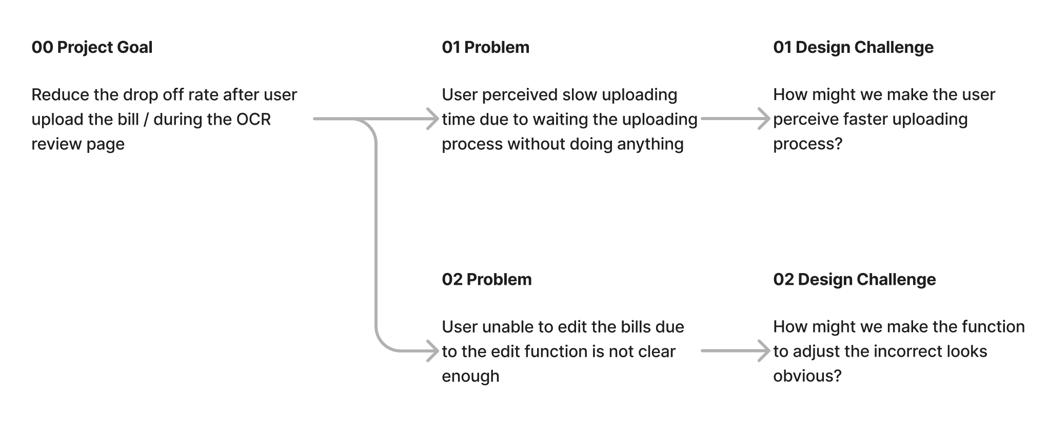
MENU
Improving Upload and Review Experience
About Split Bill
A feature in LINE Messenger Indonesia, to make bill splitting process faster and easier by using OCR technology (image processing)
Responsibility
Lead the research • Design the interface and prototype • Maintain the quality of the design in the production
Type of project
Design improvement
Timeline
Q4 2021
CONTEXT
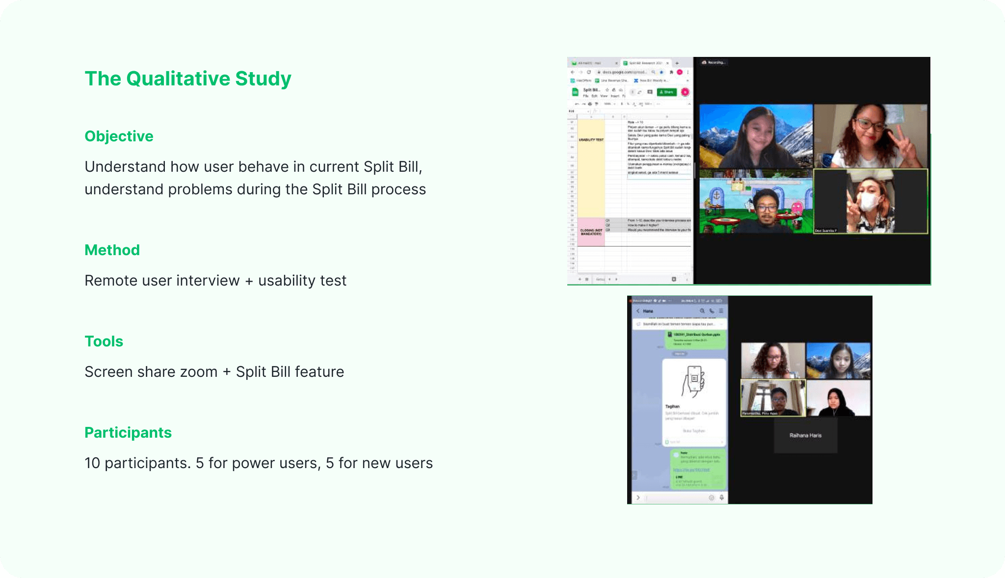
Split Bill condition
• Split Bill initially released in late 2019, but due to pandemic situation in early 2020, it got deprioritized and no improvements ever since.
• However, in 2021, as social distancing measures eased up and people started eating out in groups again, the strategy team in Indonesia saw an opportunity to serve this group of users through Split Bill.
• Indonesian product team was assigned to improve Split Bill, consisting 2 product managers, 2 product designers (one of them being me), and 3 engineers.
01 UNDERSTAND & DEFINE
Problem in the current product
We started by analyzing quantitative data to check the performance of the product and discovered that most users bounce off after they upload bill photo / in the review OCR page.
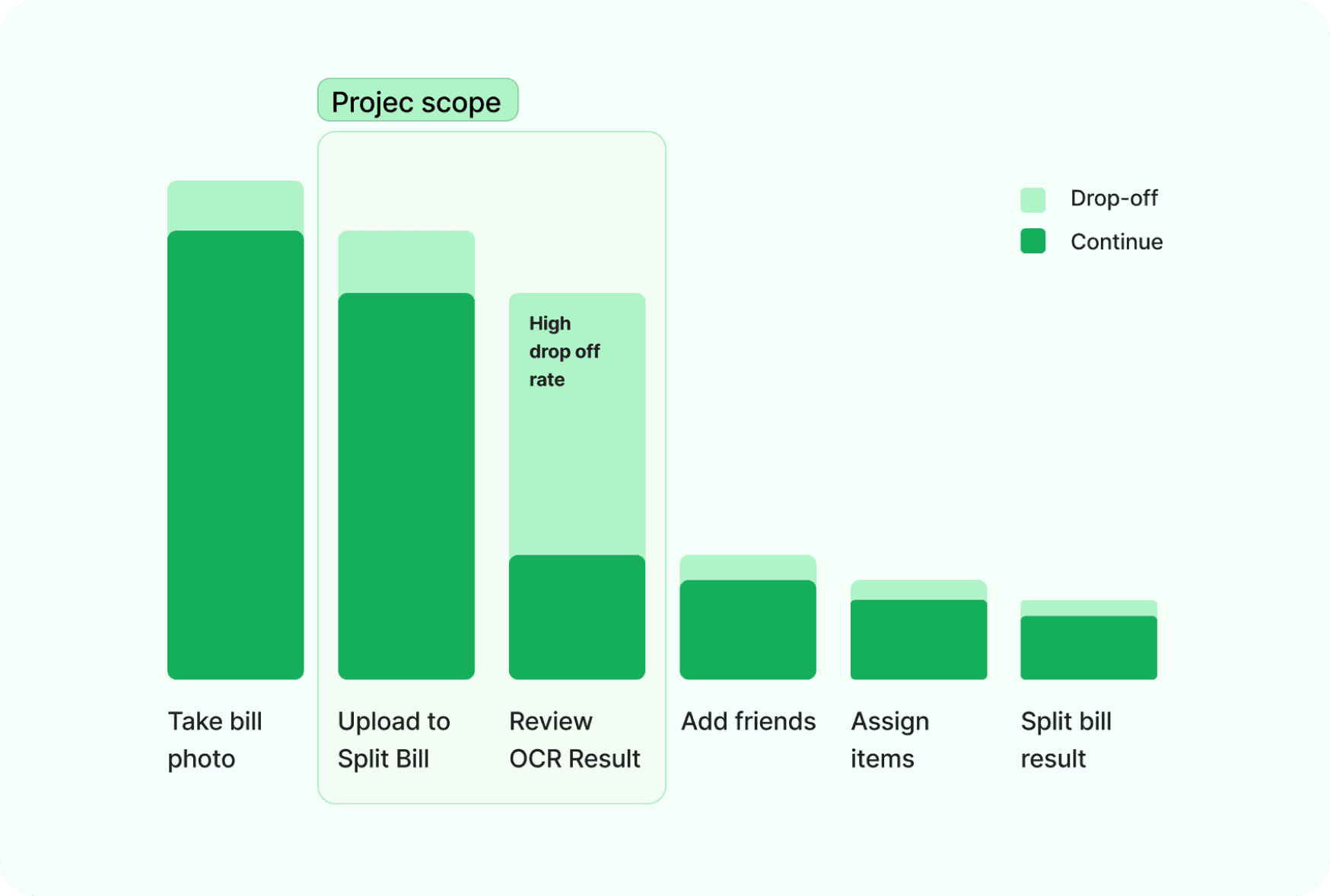
Based on that analysis, we decided to focus on reducing the drop off rate during the review OCR result / during the uploading process. But we were still confused on how should we improve it. So we conducted further qualitative study to understand more about how user currently use Split Bill and evaluate the overall process of Split Bill.
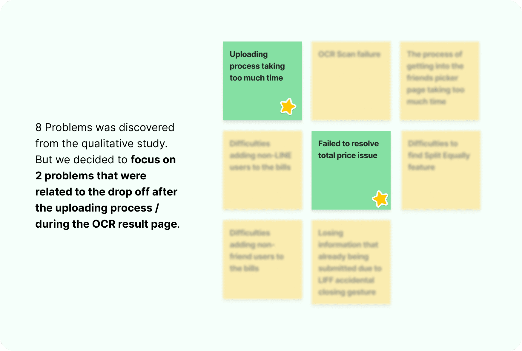
Dip dive into user's problem
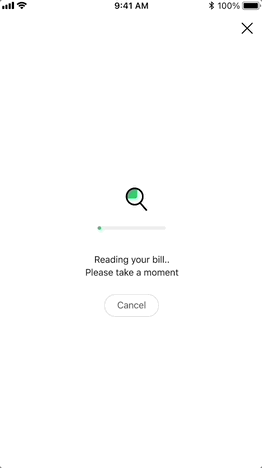
Uploading photo takes too much time
On average, time spent to upload a bill was 21,3 sec. Research suggests all process in the system below 10 sec. above that user might lose their attention and bounce off.
But due to technical issue of OCR, we were unable to improve the performance in the tech side. Hence we reframe the design challenge to this "How might we make the user perceive faster uploading process?"
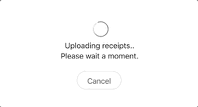
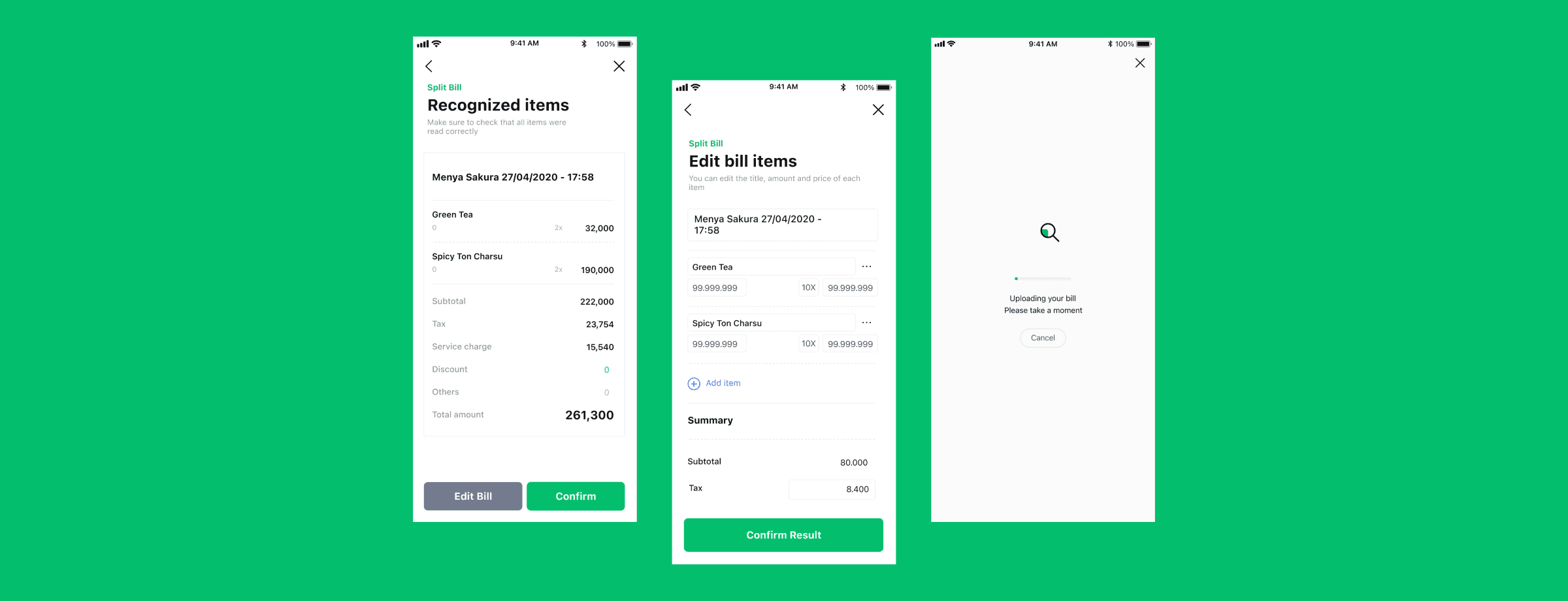
Image: Preview when user upload bill photo in Split Bill
Failed to resolve total price
The result of OCR are affected by many factors, including photo condition. Due to that, sometimes user need to do small adjustment so they can split the correct data due to incorrect OCR result. But, in the qualitative study, we discovered that for some cases, the OCR result keep giving incorrect data and they were unable to adjust the result, because they didn’t notice the result can be edited by clicking the incorrect data. So they decided to re-upload a couple times and bounce off after several failed attempts to adjust it.
We decided to proceed with this design challenge to solve the issue "How might we make the process to adjust incorrect data looks obvious?"
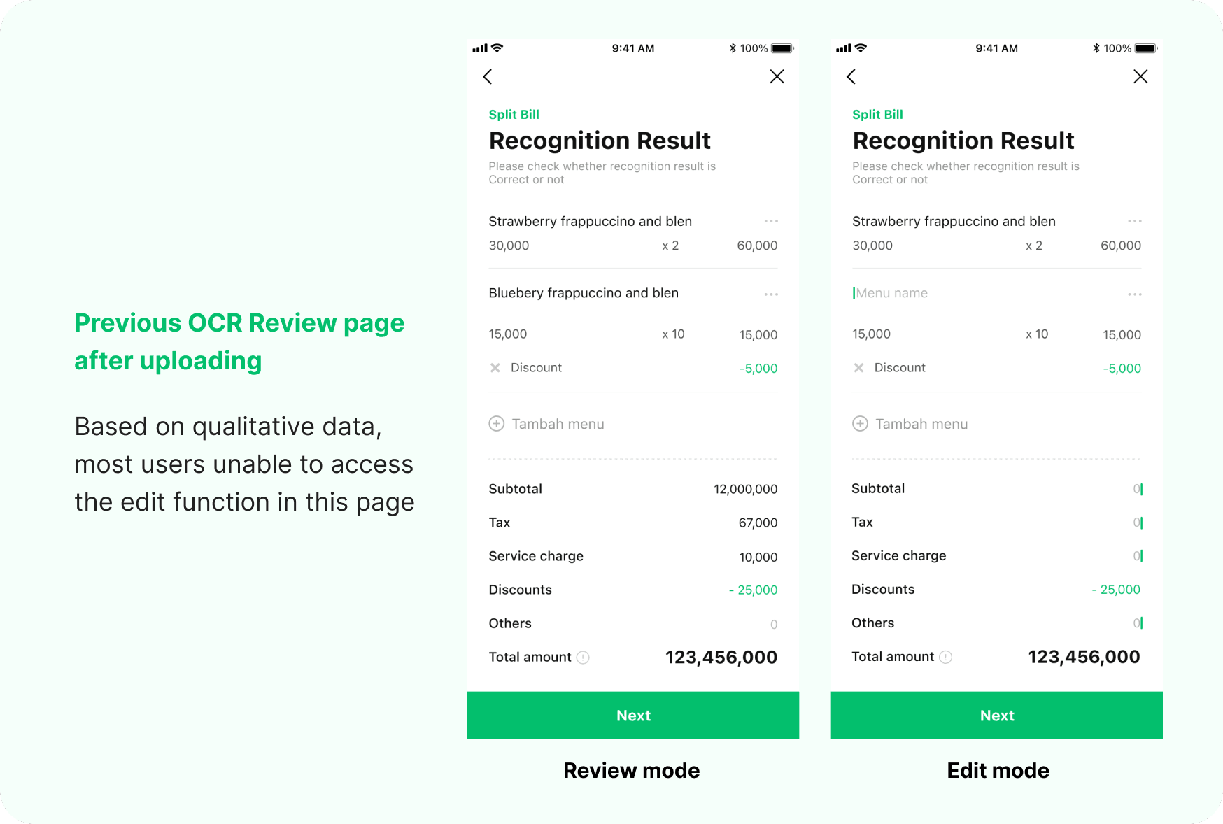
Image: Split Bill OCR review page
02 DESIGN & PROTOTYPE
Solving the problem through design
| How might we make the user feel faster uploading process?
Keep user’s attention away from waiting
Not only the animation represent old windows loading (which also takes forever), it also felt unappealing for the user to see this for more than 20 sec. According to research, unoccupied time will last longer than occupied time. So the animation should able to keep user’s attention away from waiting (unoccupied) and focus more enjoying the animation (occupied).
Idea 1: Visual distraction
1st idea: ✨ Visual distraction
The idea is to make a visual that is appealing to see while waiting the upload process. This animation is also giving user visualization on the process behind the upload, that's why they understand and able to tolerate the wait.
2nd idea: 📖 Content distraction
This idea was inspired by many games that usually implements tips and info during the loading process before / within the game. We try to copy that by using the uploading page as place to educate user about the benefits and features in the Split Bill so our user might become more expert Split Biller!
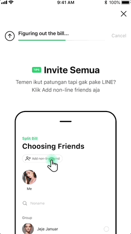
Idea 2: Content distraction
More responsive
The current uploading process is not responsive in a sense that it will keep spinning after the entire process of uploading finish. According to Doherty Threshold, 20 sec to seeing the same interface, will make users wondering whether the process is still running or not. The design should able to keep the user’s perception of responsive within the system.
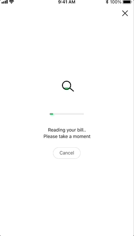
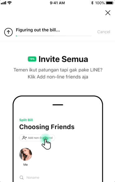
Image: Progress bar implementation
Manipulate the progress
On technical side, the process in the uploading actually consist of 2 different and respective process: (1) upload to the system, and (2) scan the items through OCR technology (significantly more time to process). Backed by zeigarnik effect, the progression animation in the progress bar should move fast and nearly reach the end for the (1) process, then followed by the small but progressive animation afterward until it reach the end. Through this way, user will likely to wait rather than bounce off.
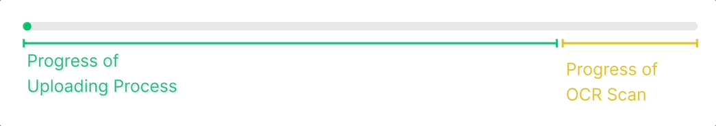
Image: Detail of progress bar progression
| How might we make the process to adjust the data looks obvious when an adjustment is needed?
Make it clear
The action to edit should keep as secondary but clear when it’s necessary. We decided to make the edit function more accessible through a different style button compared with the primary button. This way, will still raise the user's awareness of the OCR result that can be adjusted when needed by clicking the button, without confusing the main action in the page – confirm the OCR result.
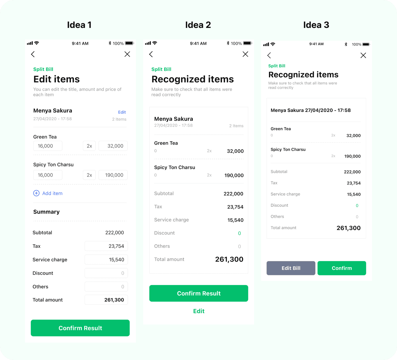
Image: Design explorations for adding Edit button
03 VALIDATE
Validate the solution
We then test the solutions by conducting another UT, to validate the ideas and decide which design is better.
• Participants: 5 participants; 3 new users + 2 loyal users
• Method: Remote usability test
• Tools: Screen share zoom + Split Bill feature
The Final Design 🚀
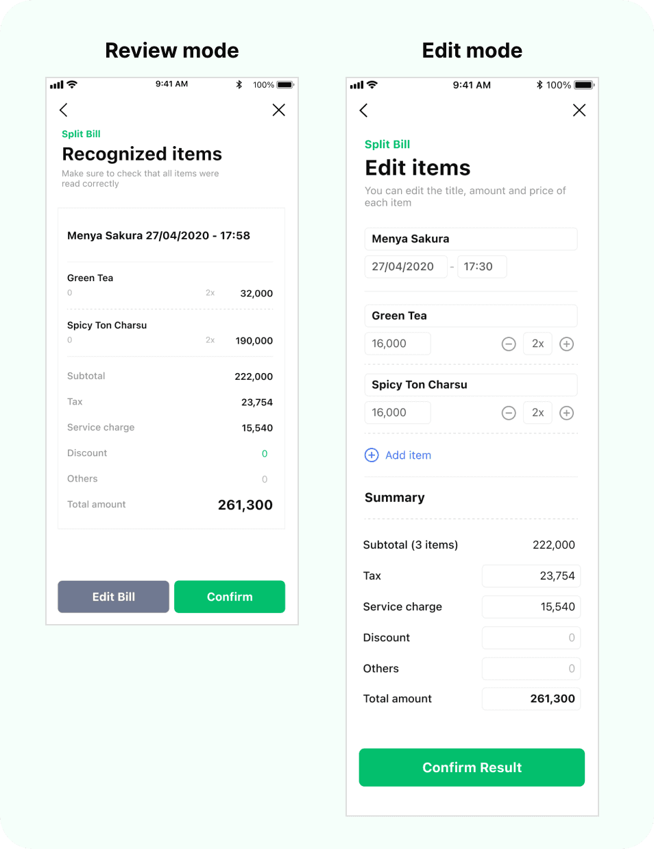
Image: Final design to solve the problem
1.) Uploading page
New design able to give a faster experience when uploading a bill, and it helps them understand whether the uploading process is working or not. The animation also proved to give a enough distraction to keep user from waiting the process.
2.) OCR Result page
The new design provides more obvious edit function by highlighting the edit button as secondary button. The users also more considerate when they review the OCR Result, because the edit button gives them awareness that the result might be perfectly accurate.
04 DEVELOPMENT
Turning the design into reality
During this process, we share our final design to the developers through our Figma file + prototype, whilst maintaining the quality of the design in the production.
We managed to make the process runs smoothly because we already involve engineers during our time exploring the design.
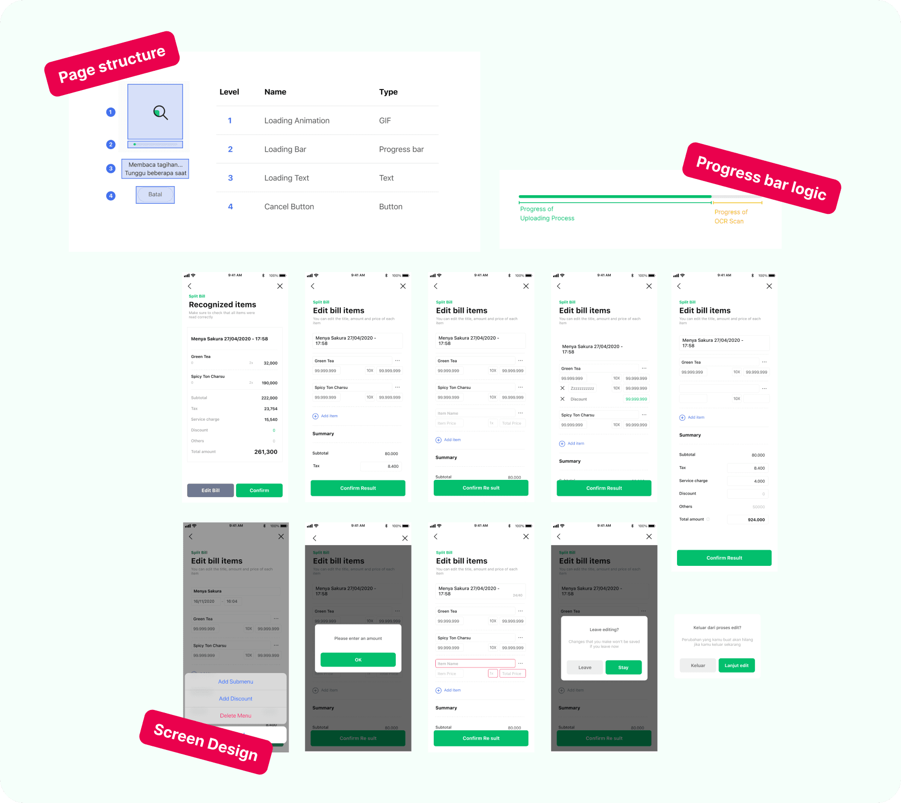
Image: Design artifacts shared to engineers
05 RESULT
Successfully reduce the drop off rate by 18% within the OCR Result page
Shout out to:
The wonderful team of LINE Split Bill